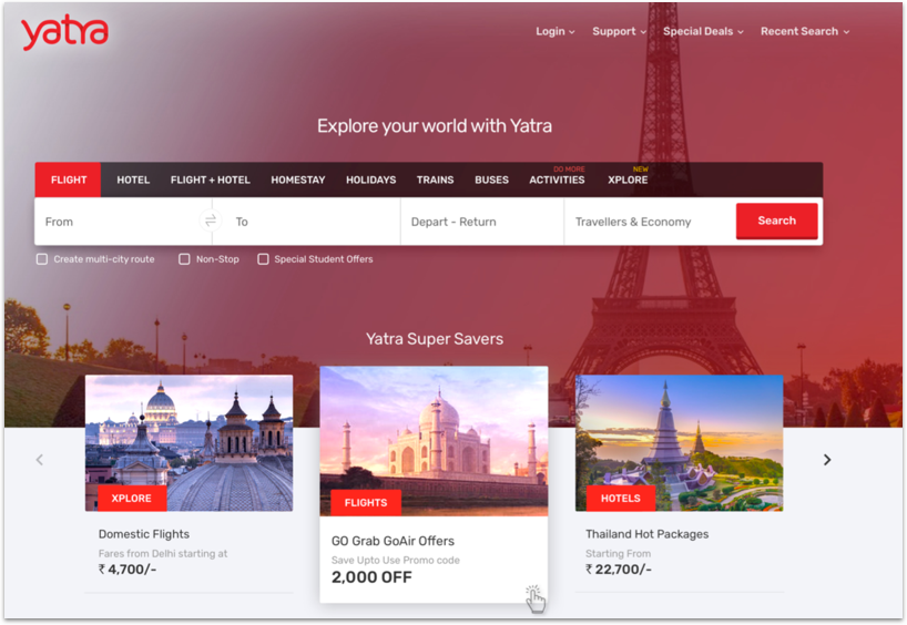
Yatra has been in the market for quite sometime and is among the market leaders, with many aqusitions and diverse products under his umbrella it still lacks the appeal of visual brand.
There were quite a few issues with respect to devicing a brand strategy but we were sure of changing it from a website i.e "yatra.com" to a brand (Yatra) having reach in all aspects of travel. We wanted to have a branding that defines and supports new categories, helps us in achieving integrated marketing communication. We wanted to make our brand fluid, free flowing innovation that is what we try to show without using any hard edges in our logo. A brand that resonates with customers and inspires employees. we changed the color palatte to a more pastal color and introduced gradiant to indicate smooth transition and delivery of services. We changed the iconography and converted them into fonticons so to help easy implementation and consistancy through out all the products. We removed a lot of visual clutter during this exercise to make content consumption easy, Focus area had been shifted from promos to search and it increased the user number insearch funnel my 17% which resulted into increased conversion. With rebranding we also updated the transition flow page so the same pages can be used by all businesses run by us. The flow of the flights verticle was update and can be downlaoaded here